GTK 4.14 will be released very soon, with new renderers that were
introduced
earlier this year.
The new renderers have much improved support for fractional scaling—on my system, I now use 125% scaling instead of the ‘Large Text’ setting, and I find that works fine for my needs.
Magical numbers
Ever since 4.0, GTK has been advocating for linear layout.
The idea is that we just place glyphs where the coordinates tell us, and if that is a fractional position somewhere between pixels, so be it, we can render the outline at that offset just fine. This approach works—if your output device has a high-enough resolution (anything above 240 dpi should be ok). Sadly, we don’t live in a world where most laptop screens have that kind of resolution, so we can’t just ignore pixels.
Consequently, we added the
gtk-hint-font-metrics
setting that forces text layout to round things to integer positions. This is not a great fit for fractional scaling, since the rounding happens in application pixels, and we really need integral device pixel positions to produce crisp results.
Application vs. device pixels
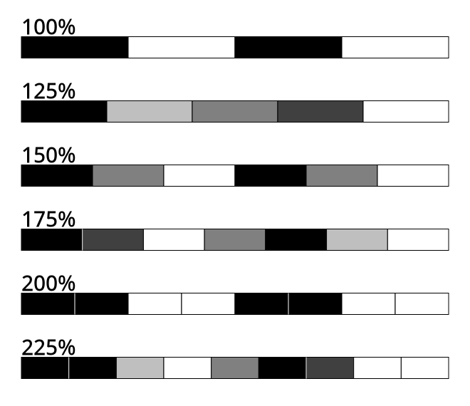
The common fractional scales are 125%, 150%, 175%, 200% and 225%. At these scales (with the exception of 200%), most application pixel boundaries do not align with device pixel boundaries.
What now?
The new renderers gave us an opportunity to revisit the topic of font rendering and do some
research
on the mechanics of hinting options, and how they get passed down the stack from GTK through Pango and cairo, and then end up in freetype as a combination of render target + load flags.
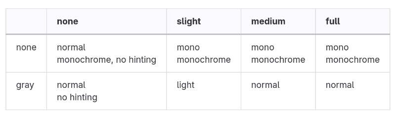
Hint style and antialiasing options translate to render mode and load flags
The new renders recognize that there’s two basic modes of operation when it comes to glyphs:
-
optimize for uniform spacing
-
optimize for crisp rendering
The former leads to subpixel positioning and unhinted rendering, the latter to hinted rendering and glyphs that are placed at integral pixel positions (since that is what the autohinter expects).
We determine which case we’re in by looking at the
font options
. If they tell us to do hinting, we round the glyph position to an integral device pixel in the y direction.
Why only y?
The autohinter only applies hinting in the vertical direction and the horizontal direction is where the increased resolution of subpixel positions helps most. If we are not hinting, then we use subpixel positions for both x and y, just like the old renderer.
A comparison
Text rendering differences are always subtle and, to some degree, a matter a taste and preference. So these screenshots should be taken with a grain of salt—it is much better to try the new renderers for yourself.
Text rendered at 125%, old renderer
Text rendered at 125%, new renderer
Both of these renderings were done at a scale of 125%, with hinting enabled.
Here is a look at some details: the horizontal bars of T and e are consistent across lines, even though we still allow the glyphs to shift by subpixel positions horizontally.
Consistent vertical placement
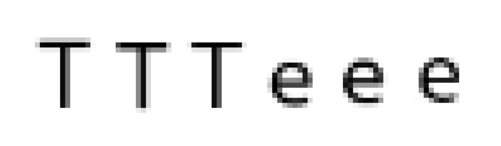
Instances of T and e, old renderer
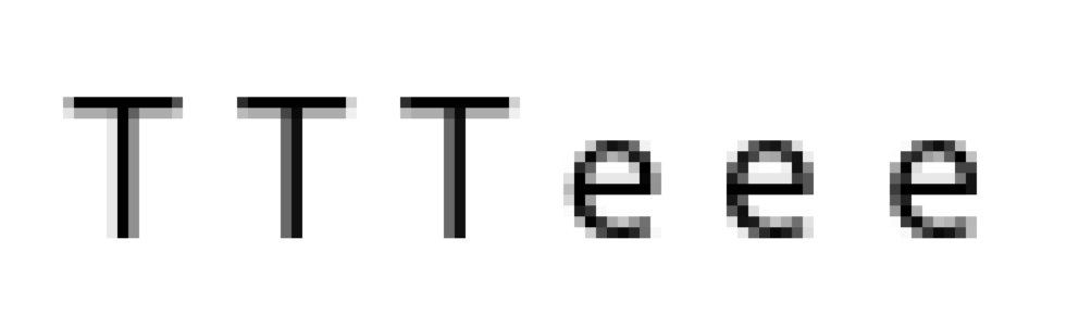
Instances of T and e, new renderer
Summary
The new renderers in GTK 4.14 should produce more crisp font rendering, in particular with fractional scaling.
Please try it out and tell us what you think.


 chevron_right